Table of Contents
What is a real estate landing page?
A real estate landing page is a web page separate from your home page dedicated to one primary goal – converting traffic into leads.
It’s where the visitor lands after they click your link, usually on advertisement and marketing campaigns.
The landing page should have one primary purpose and drive people into one action – provide their contact information, which we refer to as “lead”.
Types of landing pages
Usually, there are three main types of landing pages:
Home valuation pages
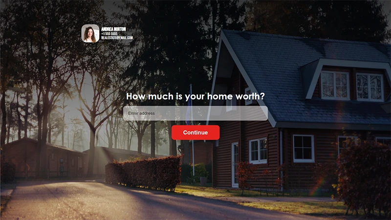
As a seller, the first thing that comes to your mind is how much the home is worth.
On this type of page, the seller will initially enter the address, and if he wants to continue, he will have to enter his contact information.
Home search pages
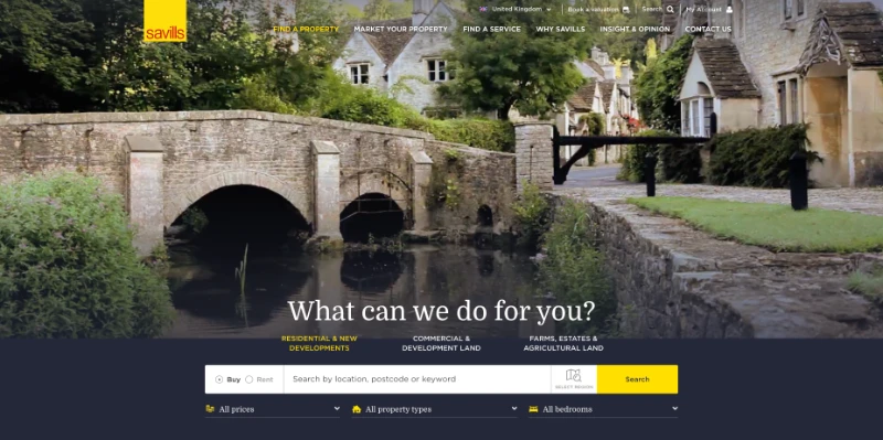
At this type, you let someone looking for a house in Los Angeles, for example, type a zip code. As a result, he will get a page of property listings in the area. If they want more information, they will have to enter their contact information.
Free content pages
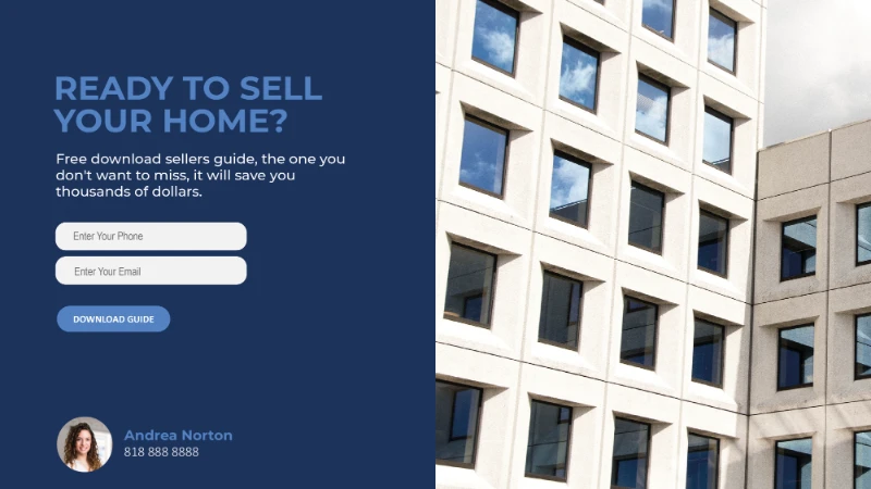
Unlike the other two types, we can attract buyers and sellers with this page type.
In this case, We will offer the visitor free content in exchange for his contact information to get the content.
The content can be a calendar, ebook, online course, or guides. We refer to this free content as a lead magnet.
In my opinion, this is the most powerful page because people like freebies of any kind.
6 reasons to include landing pages in your marketing strategy
It generates more leads
A landing page is way more effective than your basic homepage when converting traffic into leads.
The reason is the user’s expectations. The landing page has one main purpose, and when you promise the user something to click, he gets what he expected.
The user clicks on an ad because he expects specific results. Unlike a landing page, a regular homepage is full of information and can confuse him.
When expectations meet reality, visitors are more likely to corporate.
It will help you build your email list
a good email list can help you in so many ways:
You can send email marketing directly to customers you know interested in either buying or selling.
It can also help you build a buyer persona and target customers more accurately in online advertising like Facebook.
With one simple form and a clear objective, you can gather contact information quickly and grow your audience and sales accordingly.
It reduces distractions
The most critical aspect of lead conversion is reducing distractions from your potential clients.
Distractions can confuse people when they need to take action and make a decision, and nowadays, where distractions constantly surround people, it’s even more complicated.
Therefore, your main goal is to reduce their distraction and help them make the right choice.
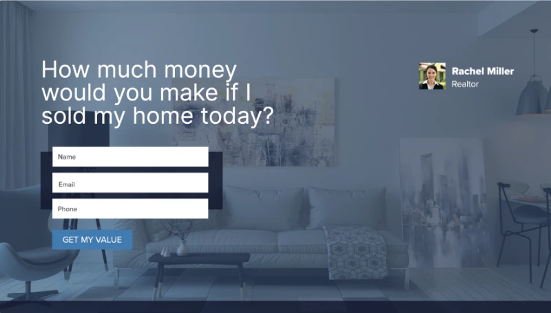
A dedicated landing page can help you focus the potential customer on a short and single content with minimum text and other elements that will distract his mind.
Remember – Less distractions = More conversions
They are easy to share
You can share real estate landing pages directly on your social media profiles like Facebook, Twitter, and Linkedin. It can also be shared on Instagram but only in bio, making Instagram a less recommended option.
Another option is to share it via email marketing and direct messaging apps such as Whatsapp, Telegram, or any app your potential clients use
You can use it in paid advertising
We highly recommend using paid advertising on social media networks for real estate. You can reach a vast audience and reach people you could never engage with in other ways.
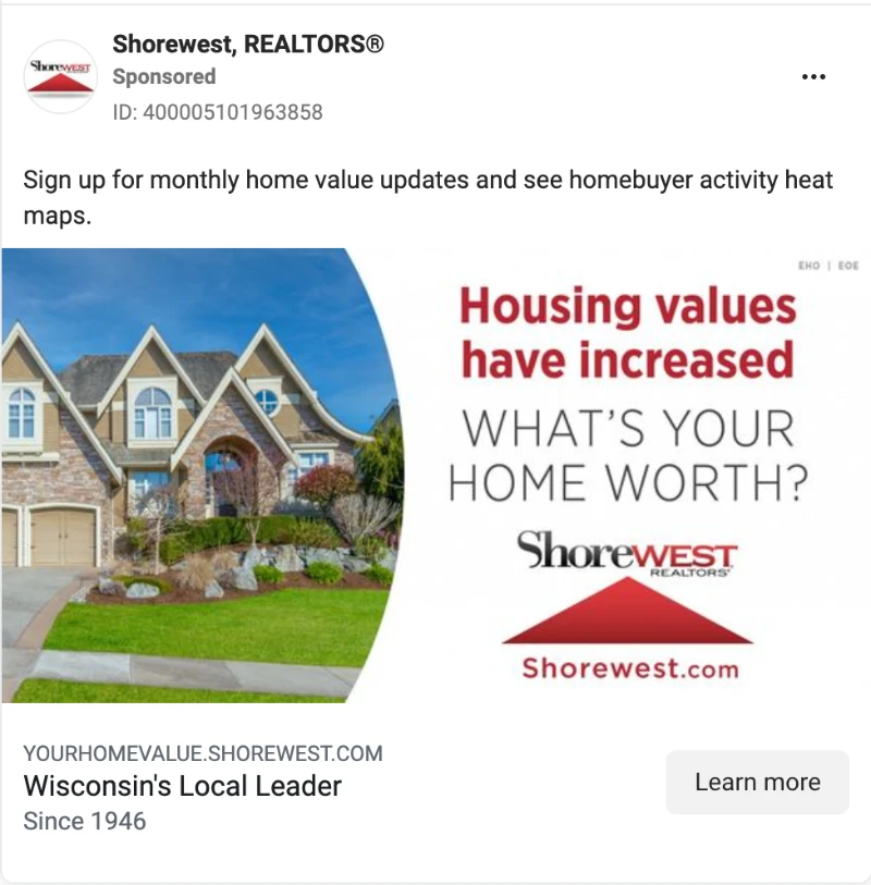
An excellent landing page is essential if you want to advertise correctly – you can track potential customers’ activity and conversions. In time will help you build the buyer persona and target the right audience with the highest probability of becoming a buyer.
Real estate landing pages can be the solution in this case.
Track & measurement is more efficient
The key to improvement is to know what’s performing well and what is n. Otherwise, you are just spending money.
It’s hard to measure your advertising to promote a general home page or a listing page because you don’t have metrics.
A dedicated landing page can offer you this option: you can track your traffic source and see how many are converted into leads, and have more effective advertising in the future.
11 tips, hacks, and strategies to make a better landing pages
Create two versions for each landing page
Split testing in advertising is when you have two versions for each creative to determine which one is doing better.
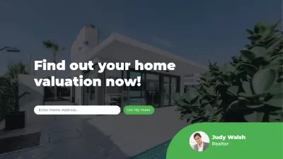
In this case, we will test the landing page. Create two versions for each page – change the headline, images, CTA, and colors, and see which one is doing better by comparing the clicks, conversion, and costs.
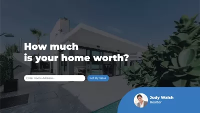
Here’s an example of two landing pages with the same design but different color themes and headlines.
Keep it short and simple
As mentioned above, we must reduce distractions and frictions. More distractions mean fewer conversions.
In this case, longer pages get lower conversion rates than a shorter landing page, and even more if the visitor doesn’t have to scroll and if he sees all the content in one glance.
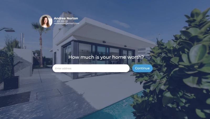
Real estate landing pages are not homepages. They shouldn’t provide information, and they have one purpose – to get visitors to click on the button and provide their contact information.
Be personal
Buying or selling a house is a huge decision for most people, and usually, it will be the most significant financial decision they will ever make.
The copy you write and your promises should be honest and trustworthy. Otherwise, people won’t work with you, and they want someone they can trust.
Write a short copy that will be clear and right on point, and what you promise, you must fulfill.
Use CTA that stands out
Our goal is to make the visitor click on the CTA, the call-to-action button.
We want to make the CTA as straightforward as possible, with colors that will stand out right away so they will know immediately where they should click, with minimum effort.
Use templates
Landing pages may look simple, but making them good and simple is usually the hardest.
Great landing pages take everything into consideration: the colors, the font size, it’s relying on the human psychology, and what drives humans into actions.
So developing one excellent page from scratch can be time-consuming, and sometimes, it’s just not worth the effort because there are companies who have already mastered it.
Creating a new page is much quicker by using a landing pages template. You only need to think about the copy (and sometimes, you don’t even have to do that), add your contact information and logo, and that’s it.
Make sure it’s mobile-friendly
According to a recent study, 98.5% of users accessing Facebook via mobile (and 81.8% doing so exclusively) – people use mobile more than desktop.
Therefore, your website must look great and be optimized for a smaller screen, as they do on a desktop. You have to make sure that every landing page you create is mobile-friendly.
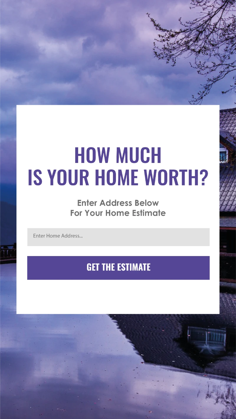
Fortunately, website builder platforms usually consider mobile-friendliness when creating the templates, so you have to do too much. Just double-check before sharing the link, especially when advertising, so you won’t spend money.
Speed is crucial
According to studies, page load time directly impacts bounce rate. Remember that our primary goal is to keep it simple.
Landing pages are usually not loaded with plenty of big images, but make sure that the images you do have, are compressed and small as possible (without affecting the overall user experience)
Various online tools will help you compress your images before uploading them to your page.
Promote an offer with value
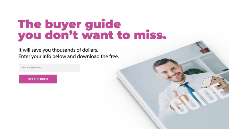
On landing pages, we offer them an offer (f.e, home valuation) or free content (f.e, eBook) in exchange for their information.
Ensure the offer provides enough value to convince our visitors to give their contact information.
Use a strong headlines
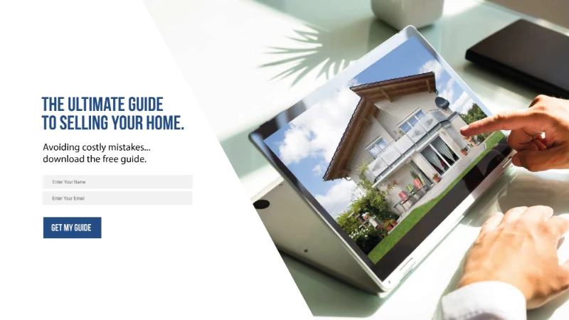
Getting the customer’s attention is complex and limited, and there’s a tiny window to do it.
The landing page’s headline is the first thing the visitor sees. It must be clear, right to the point, and easy to understand.
Use an impressive image that stands out

One of the best selling points in real estate is imagery, and real estate is all about the visual.
Your main goal is to draw their attention, reflecting the brand and the offer you provide to your visitors.
Use appealing images that professionals take. It’s easy to find eye-catching images that will draw visitors’ attention.
Don’t ask for too much information
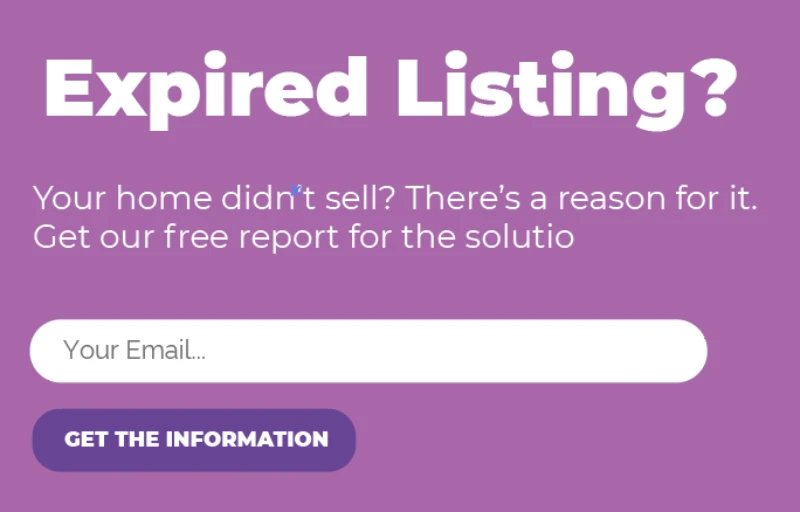
Less is more when it comes to lead-capture forms, especially on landing pages.
The more fields you have, there’s more chance they will give up.
If you want to drive visitors into action, the form should contain only the necessary information: Name, phone number, and email are more than enough.
Create your own landing pages with Property Face
In conclusion, landing pages are a great marketing tool that you must include in your marketing strategy.
It’s a powerful, affordable, cost-effective way to generate leads and grow your audience and business.
Not sure where to start?
Property Face is a marketing platform that offers you everything you need to build successful landing pages that will generate leads. Huge selection of templates to choose from, everything is ready-to-go and automated, and you can even promote them with Facebook ads right from the platform.
Sign up today and build a landing page to help you attract more buyers and sellers and sell more listings.

